KeelCompass
Enterprise SaaS · Web app
KeelCompass is Keelworks Foundation's cloud-hosted knowledge management and workforce engagement platform, helping underserved communities navigate career transitions and connect with a broader community.
I led the design of the core contribution flow that became the engine for personalized content discovery across the platform.
Users opened the platform and froze
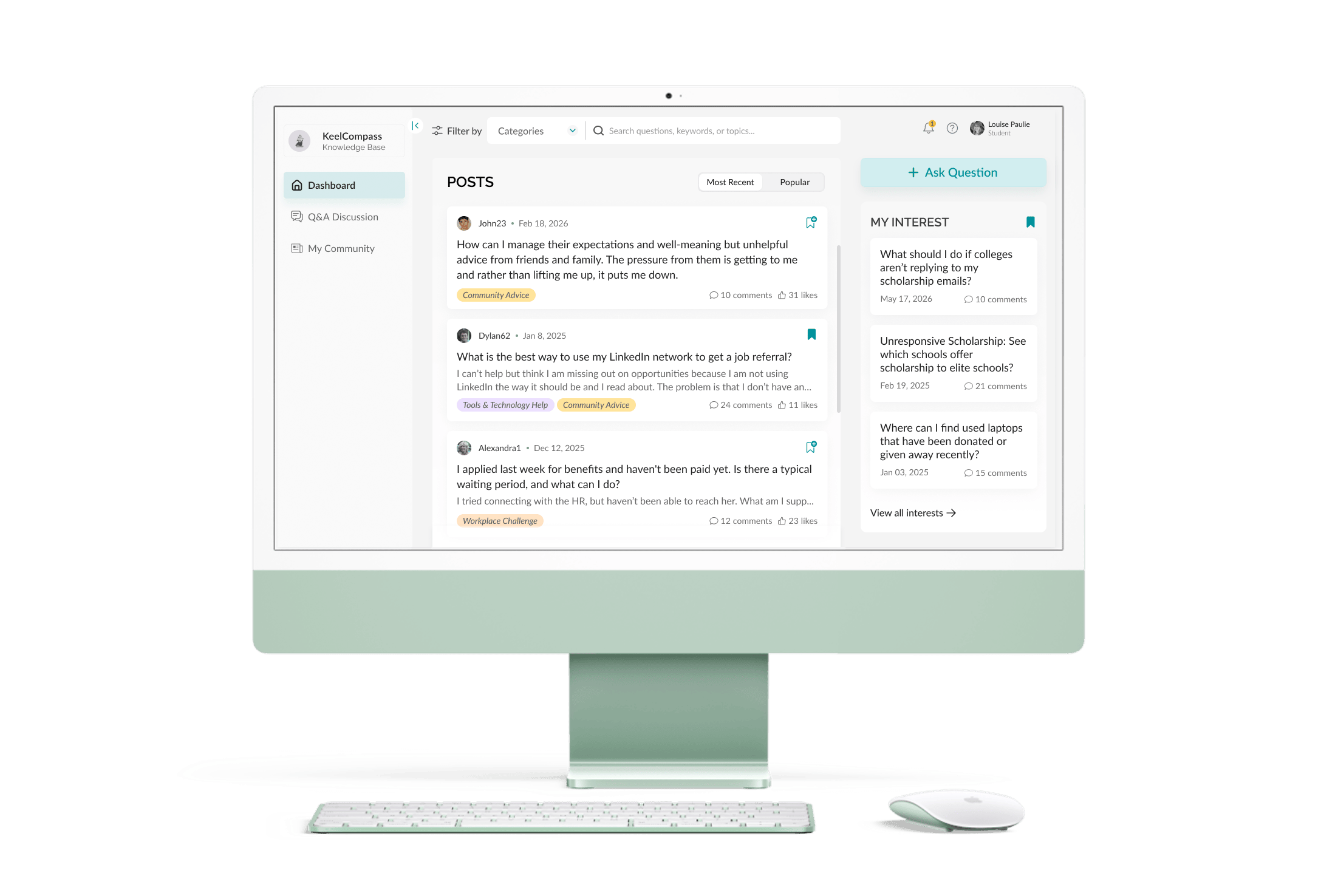
Traffic was low, return visits rarer. Users, many with low digital literacy, had nothing personalized to guide them, the platform assumed they knew what they were looking for. Most didn't. It wasn't an attitude problem. It was a design problem.
The content existed, confidence didn't
Users were intimidated because the platform offered no guidance and assumed a digital fluency most users didn't have.
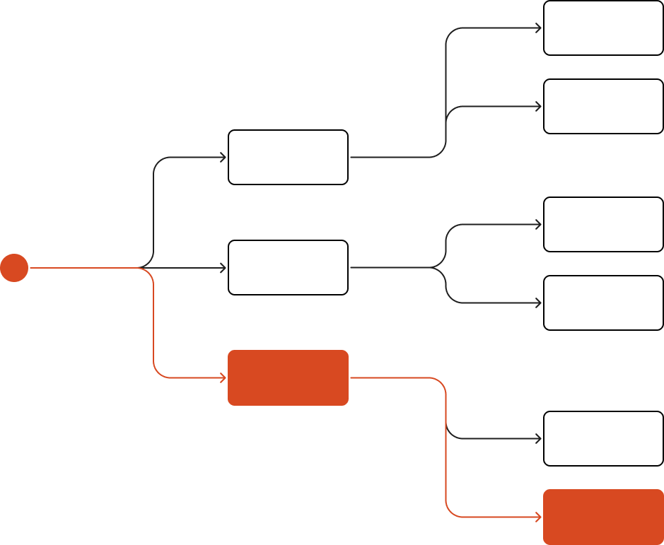
Users manually sifted through disjointed content to find one relevant post
Valuable content was hidden
Stepping into the core workflow meant losing the context that gave users confidence about what they were contributing to.
A place to start, and search that knows what you're looking for
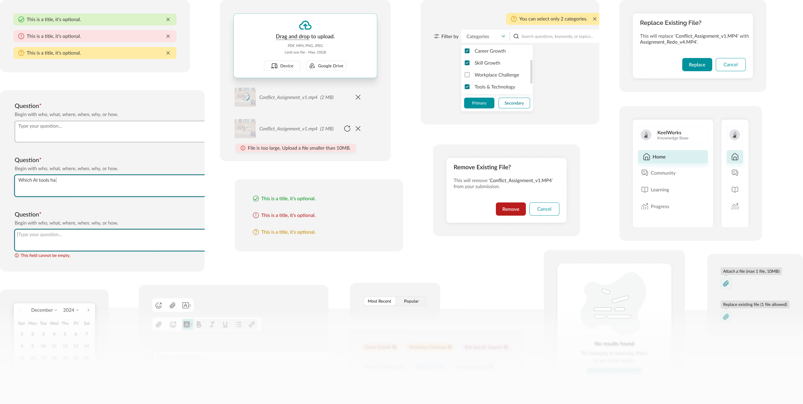
Paired search with category filtering. not more content, not a better algorithm, scopes results before you ever type a keyword, choosing from a relevant few, not scrolling through hundreds.
A page, not a modal
Replaced the "Ask a Question" modal with a dedicated full page. Users could see where they were, what they were contributing to, and what would happen after they posted.
One decision, two problems solved: reduced disorientation and increased confidence.
The constraint that became a feature
My initial approach, auto-tagging using platform data, exceeded engineering capacity. Rather than fight the constraint, I reframed it. What if users tagged their own questions during submission instead?
Every post now seeds the personalization engine directly, a user's first contribution makes the platform relevant to them.
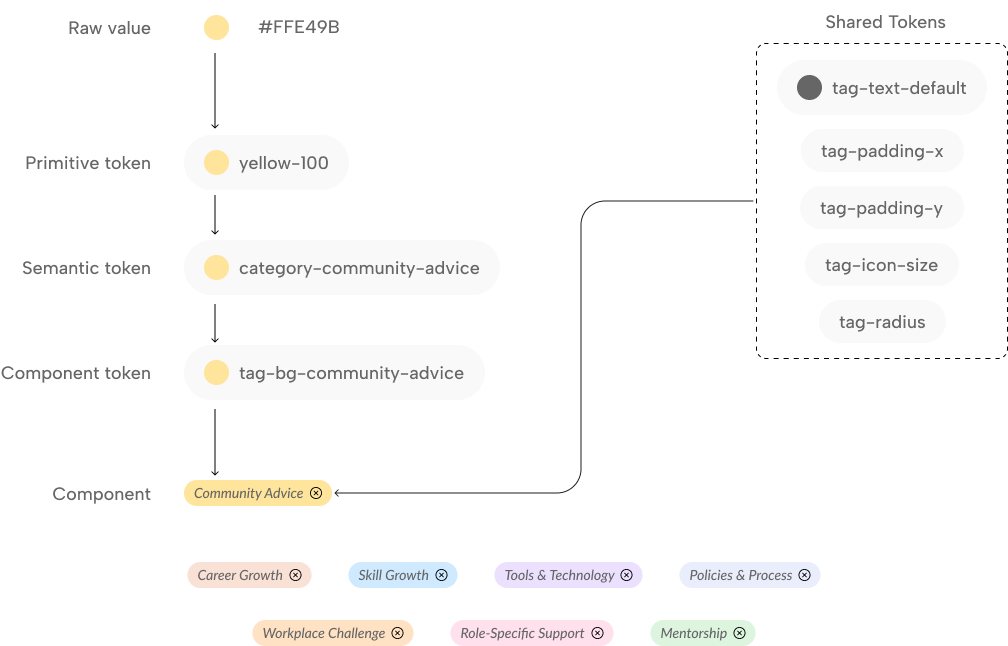
Same token pattern applied across all category tags
Mandatory category selection wasn't friction, it was scaffolding
Selecting one, up to two, tags became required before posting, counterintuitive for cautious users. But testing showed the opposite: a structured prompt gave low-literacy users a clear action to take.
Required fields can be guidance, not barriers.
Why any of this mattered
KeelCompass is built on a simple belief: that competency development, community support, and networked intelligence can drive upward mobility for underserved communities. But a platform is only as powerful as the people who use it, and the knowledge meant to power the community was going unshared and unfound.
That's where it all started!
Understanding where the existing experience broke down
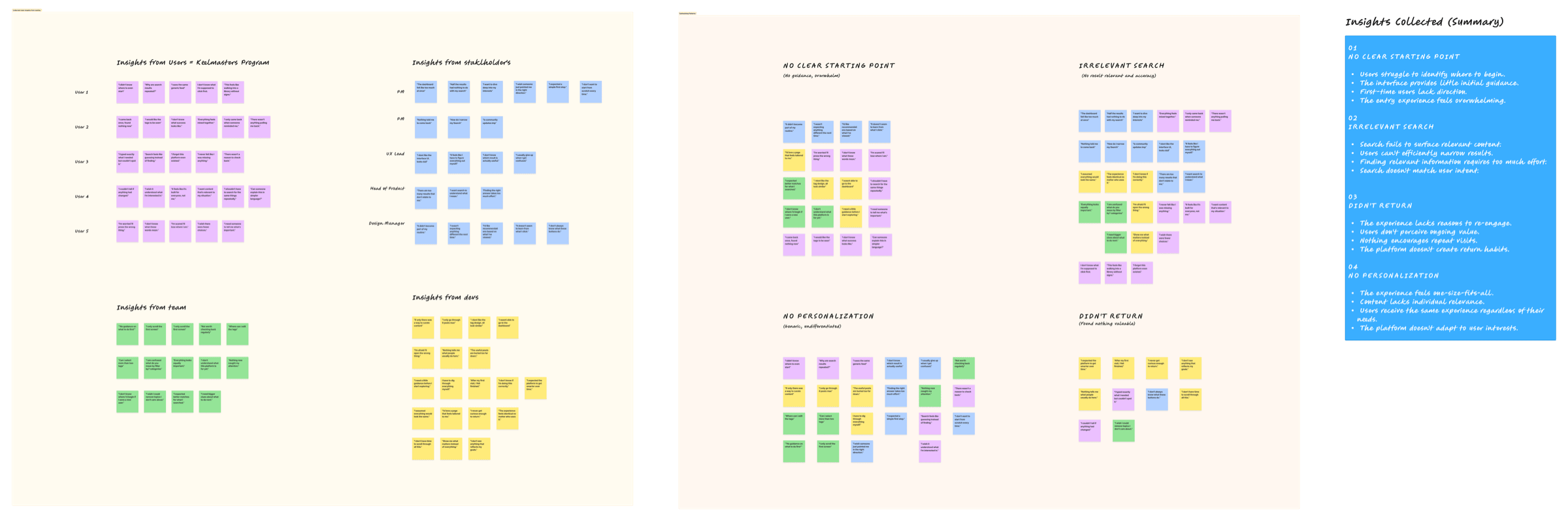
I evaluated the existing platform with stakeholders and Keelmasters participants across 14 interviews. I had my own assumptions about why users were dropping off, but the only way to test them, rather than design around a guess, was to ask users directly.
- •Why are users disengaged from the dashboard?
- •What would make it feel navigable?
Understanding what users actually needed
Not more features, a way in. Users didn't need to be taught the platform, they needed one clear, obvious first move.
Three patterns emerged: unclear discoverability, high cognitive load with no clear entry point, and low return visits, sessions were often short, with users leaving before finding anything relevant.
Translating insights into early concepts
Research pointed to three design directions, each targeting a specific breakdown in the existing experience.
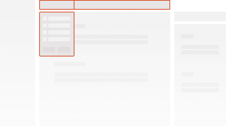
Category-based filtering with keyword search
Narrows the feed before scrolling, no more manually digging through loads of info

Ask a question, see what's relevant
Pairs a clear entry point with content aligned to users interests
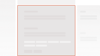
Introduced category tags at question creation
A structured way to label questions, the input that powers personalization
Evaluating ideas against research and technical constraints
Working closely with engineering and the PM’s, I pitched each direction against technical feasibility, product goals, and what it would add to the platform as a whole.
These technical limitations became the core mechanic of the personalization system.
Search bar + Category filter
- ✓Implements on existing search (no new UI pattern)
- ✓Shares category taxonomy with tagging, reuses backend logic
- ✓Reduces query ambiguity
- –One extra click before narrowing resultsn

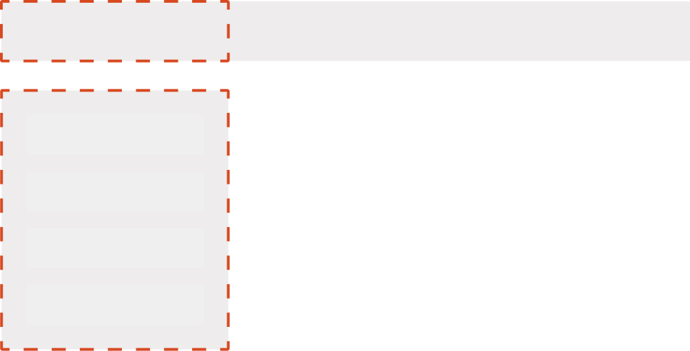
CTA + My Interests
- ✓Primary CTA, entry point to the personalization flow
- ✓Preserves My Interests component state, no unmount on modal open
- ✓Co-locates highest-traffic elements, reduces navigation depth
- –Higher information density, requires careful spatial hierarchy
Tagging at question creation
- ✓Feasible with current engineering scope, auto-tagging wasn't
- ✓Tag data feeds recommendation engine directly
- –Requires user to self-classify tags
Learning from what already existed
There are countless ways to build search and content discovery. Informed by competitive research, I explored many directions for both search and the Ask a Question flow before settling on what can ship.
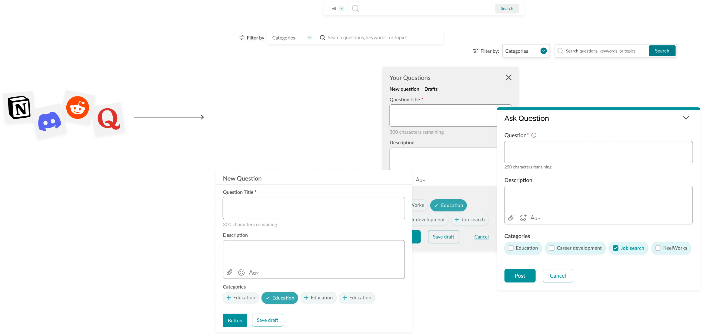
Clearest signal: open-ended categories recreate the same overwhelm we were trying to fix
That's why KeelCompass ships with 8 fixed categories, not an open taxonomy. Research that changed what we shipped, not just what we knew.

Testing the first prototype
After exploring several directions across search, tagging, and the dashboard layout, I brought the strongest concepts together into one prototype, ready to tests.
Addressing feedback
Testing with users, stakeholders, and engineers surfaced patterns across six areas, shaping three key changes to the final design.
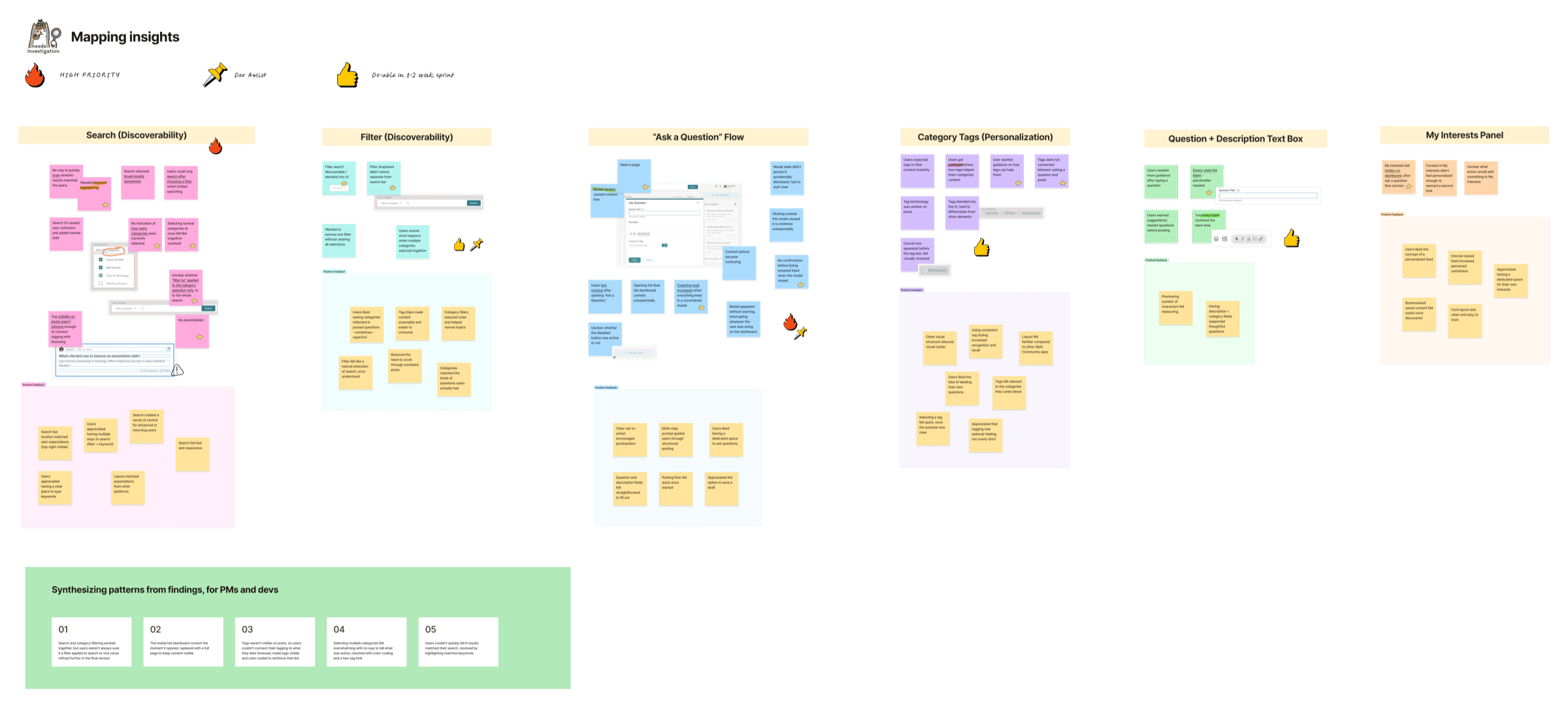

- •Reduce ambiguity → a full page instead of a modal
- •Make state visible → color-coded, visible tags
- •Connect actions to their outcome → keyword-highlighted search
A task-oriented experience built around what users actually need to do
Three connected changes made KeelCompass feel like it was built for you.
We thought users needed more guidance. They needed less friction, fewer steps between wanting to ask and asking, between tagging and it mattering.
Confidence over confusion
- •During usability testing, 9 out of 10 low-digital-literacy users reported feeling confident navigating a journey personalized to their needs
- •Replacing manual content discovery with structured search and category filtering reduced cognitive load for first-time users
Key Learnings
- •Don't fight a constraint, use it. Sometimes the thing that can't be built points toward something better than the original plan.
- •Rough, vibe-coded concepts got in front of real people fast, turns out you don't need a fully-coded, pixel-perfect prototype to find out something's confusing.
- •Getting specific about who we were designing for made both design decisions and engineering's to-do list a lot clearer.